
收藏一些css的高级用法:
1、黑白图像
这段代码会让你的彩色照片显示为黑白照片1
2
3
4
5
6
7img.desaturate {
filter: grayscale(100%);
-webkit-filter: grayscale(100%);
-moz-filter: grayscale(100%);
-ms-filter: grayscale(100%);
-o-filter: grayscale(100%);
}
2、使用 :not() 在菜单上应用/取消应用边框
先给每一个菜单项添加边框1
2
3
4/* add border */
.nav li {
border-right: 1px solid #666;
}
……然后再除去最后一个元素……1
2
3
4// remove border /
.nav li:last-child {
border-right: none;
}
……可以直接使用 :not() 伪类来应用元素:1
2
3.nav li:not(:last-child) {
border-right: 1px solid #666;
}
这样代码就干净,易读,易于理解了。
当然,如果你的新元素有兄弟元素的话,也可以使用通用的兄弟选择符(~):1
2
3.nav li:first-child ~ li {
border-left: 1px solid #666;
}
3、页面顶部阴影
下面这个简单的 CSS3 代码片段可以给网页加上漂亮的顶部阴影效果:1
2
3
4
5
6
7
8
9
10
11
12body:before {
content: "";
position: fixed;
top: -10px;
left: 0;
width: 100%;
height: 10px;
-webkit-box-shadow: 0px 0px 10px rgba(0,0,0,.8);
-moz-box-shadow: 0px 0px 10px rgba(0,0,0,.8);
box-shadow: 0px 0px 10px rgba(0,0,0,.8);
z-index: 100;
}
4、逗号分隔的列表
让HTML列表项看上去像一个真正的,用逗号分隔的列表:1
2
3ul > li:not(:last-child)::after {
content: ",";
}
5、优化显示文本
有时,字体并不能在所有设备上都达到最佳的显示,所以可以让设备浏览器来帮助你:1
2
3
4
5html {
-moz-osx-font-smoothing: grayscale;
-webkit-font-smoothing: antialiased;
text-rendering: optimizeLegibility;
}
6、CSS3 calc() 的使用
calc() 用法类似于函数,能够给元素设置动态的值:1
2
3
4
5
6
7
8
9
10/* basic calc */
.simpleBlock {
width: calc(100% - 100px);
}
/* calc in calc */
.complexBlock {
width: calc(100% - 50% / 3);
padding: 5px calc(3% - 2px);
margin-left: calc(10% + 10px);
}
7、文本渐变
文本渐变效果很流行,使用 CSS3 能够很简单就实现:1
2
3
4
5
6
7
8
9
10
11h2[data-text] {
position: relative;
}
h2[data-text]::after {
content: attr(data-text);
z-index: 10;
color: #e3e3e3;
position: absolute;
top: 0;
left: 0;
-webkit-mask-image: -webkit-gradient(linear, left top, left bottom, from(rgba(0,0,0,0)), color-stop(50%, rgba(0,0,0,1)), to(rgba(0,0,0,0)));}
8、禁用鼠标事件
CSS3 新增的 pointer-events 让你能够禁用元素的鼠标事件,例如,一个连接如果设置了下面的样式就无法点击了。1
.disabled { pointer-events: none; }
9、文本模糊
简单但很漂亮的文本模糊效果,简单又好看!1
2
3
4.blur {
color: transparent;
text-shadow: 0 0 5px rgba(0,0,0,0.5);
}
10、DIV可编辑,就是让一个div变成一个类似input输入框的效果。
在div中添加contentEditable=”true”属性就可以了,如下:1
2
3
4
5<div id="div1" contentEditable="true" ></div>
<div id="div2" contentEditable="true" ></div>
<div contentEditable="true" id="div3"></div>
其中,我后面有篇编辑器的文章 http://www.haorooms.com/post/js_guangbiao 就用到了这个功能!这个是获得iframe光标所在位置的父节点名称,iframe中就用到了contentEditable=”true” 属性
11、有些网站为了不让用户复制,设置了div禁止选择的功能,设置如下属性:
1 | unselectable="on" onselectstart="return false;" |
具体代码:1
2
3<div unselectable="on" onselectstart="return false;">
sdfsdfswerwer324234234234
</div>
这样,div里面的东西就不能选择复制了!
12、CSS 中form表单两端对齐
做form表单的时候,前面经常有姓名,年龄,公司名称等等,有的是2个字,有的是4个字,如何让字对齐呢?有的人的做法是打几个空格,但是这样不是很准确,最好的办法是如下:
css代码:1
2
3
4
5
6
7
8
9
10
11
12
13
14
15
16.test1 {
text-align:justify;
text-justify:distribute-all-lines;/*ie6-8*/
text-align-last:justify;/* ie9*/
-moz-text-align-last:justify;/*ff*/
-webkit-text-align-last:justify;/*chrome 20+*/
}
@media screen and (-webkit-min-device-pixel-ratio:0){/* chrome*/
.test1:after{
content:".";
display: inline-block;
width:100%;
overflow:hidden;
height:0;
}
}
html代码:1
2
3
4
5
6
7<div class="box1">
<div class="test1">姓 名</div>
<div class="test1">姓 名 姓 名</div>
<div class="test1">姓 名 名</div>
<div class="test1">所 在 地</div>
<div class="test1">工 作 单 位</div>
</div>
13、input声音录入按钮,(紧支持谷歌)效果如下图:
如下图红色框框中的按钮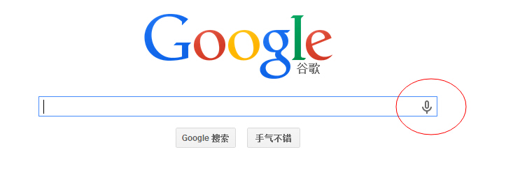
代码如下:1
<input type="text" class="box" name="s" id="s" class="inputText" placeholder="输入关键词" x-webkit-speech>
添加 x-webkit-speech 属性就可以了。
14、给input的placeholder设置颜色
设置方法如下:1
2
3
4
5
6
7
8
9
10
11
12::-webkit-input-placeholder { /* WebKit browsers */
color: #999;
}
:-moz-placeholder { /* Mozilla Firefox 4 to 18 */
color: #999;
}
::-moz-placeholder { /* Mozilla Firefox 19+ */
color: #999;
}
:-ms-input-placeholder { /* Internet Explorer 10+ */
color: #999;
}
15、css input[type=file] 样式美化,input上传按钮美化
思路:input file上传按钮的美化思路是,先把之前的按钮透明度opacity设置为0,然后,外层用div包裹,就实现了美化功能。
代码如下:
DOM结构:1
2
3
4
5
6
7<a href="javascript:;" class="a-upload">
<input type="file" name="" id="">点击这里上传文件
</a>
<a href="javascript:;" class="file">选择文件
<input type="file" name="" id="">
</a>
CSS样式1:1
2
3
4
5
6
7
8
9
10
11
12
13
14
15
16
17
18
19
20
21
22
23
24
25
26
27
28
29
30
31
32
33/*a upload */
.a-upload {
padding: 4px 10px;
height: 20px;
line-height: 20px;
position: relative;
cursor: pointer;
color: #888;
background: #fafafa;
border: 1px solid #ddd;
border-radius: 4px;
overflow: hidden;
display: inline-block;
*display: inline;
*zoom: 1
}
.a-upload input {
position: absolute;
font-size: 100px;
right: 0;
top: 0;
opacity: 0;
filter: alpha(opacity=0);
cursor: pointer
}
.a-upload:hover {
color: #444;
background: #eee;
border-color: #ccc;
text-decoration: none
}
CSS样式2:1
2
3
4
5
6
7
8
9
10
11
12
13
14
15
16
17
18
19
20
21
22
23
24
25
26.file {
position: relative;
display: inline-block;
background: #D0EEFF;
border: 1px solid #99D3F5;
border-radius: 4px;
padding: 4px 12px;
overflow: hidden;
color: #1E88C7;
text-decoration: none;
text-indent: 0;
line-height: 20px;
}
.file input {
position: absolute;
font-size: 100px;
right: 0;
top: 0;
opacity: 0;
}
.file:hover {
background: #AADFFD;
border-color: #78C3F3;
color: #004974;
text-decoration: none;
}
修改后如下: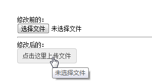
备注:对于HTML5之input:file,还可以控制上传的类型的,但是这个是html5的,低版本浏览器不支持
16、超出长度显示省略号
单行文本显示…
一般要指定宽度,然后给如下四个属性。1
2
3
4display:bolck;
overflow:hidden;
white-space:nowrap;
text-overflow:ellipsis;
案例代码:1
2
3
4
5
6
7.demo{
width:200px; /*指定宽度*/
display:bolck;
overflow:hidden;
white-space:nowrap;
text-overflow:ellipsis;
}
多行文本显示…
主要属性-webkit-line-clamp1
2
3
4
5
6
7p {
overflow : hidden;
text-overflow: ellipsis;
display: -webkit-box;
-webkit-line-clamp: 2;
-webkit-box-orient: vertical;
}
这个属性比较合适WebKit浏览器或移动端(绝大部分是WebKit内核的)浏览器。
跨浏览器兼容的方案
比较靠谱简单的做法就是设置相对定位的容器高度,用包含省略号(…)的元素模拟实现;1
2
3
4
5
6
7
8
9
10
11
12
13
14
15
16
17p {
position:relative;
line-height:1.4em;
/* 3 times the line-height to show 3 lines */
height:4.2em;
overflow:hidden;
}
p::after {
content:"...";
font-weight:bold;
position:absolute;
bottom:0;
right:0;
padding:0 20px 1px 45px;
// background:url(和网页背景颜色一样的一张背景图) repeat-y;
background-color:#fff;
}
注意:1
2
3
4height高度正好是line-height的3倍;
结束的省略好用了半透明的png做了减淡的效果,或者设置背景颜色;
IE6-7不显示content内容,所以要兼容IE6-7可以是在内容中加入一个标签,比如用...去模拟;
要支持IE8,需要将::after替换成:after;
17、CSS强制换行和不换行
自动换行1
2
3
4div{
word-wrap: break-word;
word-break: normal;
}
强制英文单词断行1
2
3div{
word-break:break-all;
}
强制不换行1
2
3div{
white-space:nowrap;
}
18、渐变效果
默认渐变是从上往下代码如下:1
2
3
4
5
6
7.demo{
background:#ed4a60;
background: -webkit-linear-gradient(#ed5a5e, #ed3a61);
background: -o-linear-gradient(#ed5a5e, #ed3a61);
background: -moz-linear-gradient(#ed5a5e, #ed3a61);
background: linear-gradient(#ed5a5e, #ed3a61);
}
前面加一个参数,right,left,bottom,top等,就可以指定渐变方向:1
2
3
4
5
6.demo{
background:-moz-linear-gradient(left,#ace,#f96);/*Mozilla*/
background:-webkit-gradient(linear,0 50%,100% 50%,from(#ace),to(#f96));/*Old gradient for webkit*/
background:-webkit-linear-gradient(left,#ace,#f96);/*new gradient for Webkit*/
background:-o-linear-gradient(left,#ace,#f96); /*Opera11*/
}
还可以从左上角开始渐变left top,right top(右上角)以此类推,代码如下:1
2
3
4
5.demo{
background: -moz-linear-gradient(left top, #ace, #f96);
background: -webkit-linear-gradient(left top, #ace, #f96);
background: -o-linear-gradient(left top, #ace, #f96);
}
另外还可以指定渐变角度,这个角度是一个由水平线与渐变线产生的的角度,逆时针方向。因此,使用0deg将产生一个左到右横向梯度,而90度将创建一个从底部到顶部的垂直渐变。
代码如下:1
2
3
4
5
6
7
8
9
10
11
12
13.demo {
background: -moz-linear-gradient(<angle>, #ace, #f96);
background: -webkit-gradient(<type>,<angle>, from(#ace), to(#f96));/*老的写法*/
background: -webkit-linear-gradient(<angle>, #ace, #f96);
background: -o-linear-gradient(<angle>, #ace, #f96);
}
.demo {
background: -moz-linear-gradient(45deg, #ace, #f96);
background: -webkit-gradient(linear,0 100%,100% 0%,from(#ace),to(#f96));
background: -webkit-linear-gradient(45deg, #ace, #f96);
background: -o-linear-gradient(45deg, #ace, #f96);
}
18、背景渐变动画
CSS中最具诱惑的一个功能是能添加动画效果,除了渐变,你可以给背景色、透明度、元素大小添加动画。目前,你不能为渐变添加动画,但下面的代码可能有帮助。它通过改变背景位置,让它看起来有动画效果。1
2
3
4
5
6
7
8
9button {
background-image: linear-gradient(#5187c4, #1c2f45);
background-size: auto 200%;
background-position: 0 100%;
transition: background-position 0.5s;
}
button:hover {
background-position: 0 0;
}
19、只在一边或两边显示盒子阴影
如果你要一个盒阴影,试试这个技巧,能为任一边添加阴影。为了实现这个,首先定义一个有具体宽高的盒子,然后正确定位:after伪类。实现底边阴影的代码如下:1
2
3
4
5
6
7
8
9
10
11
12
13
14
15
16
17
18
19
20
21
22
23
24.box-shadow {
background-color: #FF8020;
width: 160px;
height: 90px;
margin-top: -45px;
margin-left: -80px;
position: absolute;
top: 50%;
left: 50%;
}
.box-shadow:after {
content: "";
width: 150px;
height: 1px;
margin-top: 88px;
margin-left: -75px;
display: block;
position: absolute;
left: 50%;
z-index: -1;
-webkit-box-shadow: 0px 0px 8px 2px #000000;
-moz-box-shadow: 0px 0px 8px 2px #000000;
box-shadow: 0px 0px 8px 2px #000000;
}
20、用CSS动画实现省略号动画
这个片段将帮助你制造一个ellipsis的动画,对于简单的加载状态是很有用的,而不用去使用gif图像。1
<div class="loading">Loading</div>
css代码片段1
2
3
4
5
6
7
8
9
10
11
12
13
14
15.loading:after {
overflow: hidden;
display: inline-block;
vertical-align: bottom;
animation: ellipsis 2s infinite;
content: "\2026"; /* ascii code for the ellipsis character */
}
@keyframes ellipsis {
from {
width: 2px;
}
to {
width: 15px;
}
}
21、通用媒体查询
1 | /* Smartphones (portrait and landscape) ----------- */ |